Discovering ways to make my abstract acrylics pop with emotion and take the viewer by surprise. I'm sort of leaning towards seascapes, the sea coast, shore, or beach - whichever you prefer to call it. I love the texture of sand, surf and foam, the sweet green colors that range from teal to sage, seaweed, sand dollars and crabs for a hint of orange-brown for contrast. How I love the waves that crash endlessly upon the sand, some dark and ominous and others pale in comparison and submissive to earth.
I love the look of encaustic - but have no desire to catch the house on fire again using hot plates to melt wax, blow torches, butane torches or other fire-y sorts of tools and techniques. So how can I recreate these encaustic-like paintings that reflect the true nature and texture of the coast? Well...
Doing some research, it looks like Liquitex offers all sorts of texture mediums to mix with the paint, so like in ecaustics, mixing sand with the wax and color, I can add the Liquitex to my acrylics to achieve that same beautiful texture to my non-encaustic paintings. YAY!
Their "effects mediums" line includes the following (found here!):
Black Lava
Fabric Effects
Ceramic Stucco
Blended Fibers
Natural Sand
Resin Sand
and more!
I'm going to order some of these and experiment - watch for the latest developments here!
Tuesday, July 25, 2017
Saturday, July 22, 2017
Dirty to Clean Pours.. and more!
More Dirty Pour Paintings...


and now - HOW TO DO CLEAN POURS:


Autumn Falls

Blue Chase

Blue Velvet

Sutter Hill, CA

Brain Waves

Sea Foam

Warp

Serene

Convergence
- Mix the paint exactly the same as for dirty pours except no Floetrol or silicone. Just paint, pouring medium and water.
- Prepare canvas the same way.
- I pour the paint (of each color) directly on the canvas and move the canvas around for it to move in the direction I want it to go.
- For the following painting, Malloy's Lake (Inspired by an art print by Matthew Malloy), I poured red, yellow, fuchsia, blue and white in diagonals across the top 2/3 of the canvas. Then I titled the painting so that the colors would mix and combine to create this awesome sunset.
- I let that set up for about 4 hours before I poured the bottom third of the canvas. That would be stripes of green, brown, yellow, and light brown. These would be diagonal but not as extreme as the sky was. I was trying to get the look of fields and a meadow.
- When it was dry, I painted with black-brown mixture of acrylic the small hills and trees. On the bottom third I added a little brushwork in brown to indicate plant growth.

Malloy's Lake
THANKS FOR STOPPING BY!
Poured Acrylics - How to do them
Hello art lovers!
Laila asked me a great question in my last post about the way to do poured acrylic paintings so here is the description of that technique (how I do it, anyway!) And more photos of work I've done since the last post are coming next.
Mixing the Paint for a "Dirty Pour" - Next Post: "Doing a Clean Pour"
I mix artist acrylic paint with Floetrol - an indoor/outdoor flow medium used for house painters - you could use something Liquitex Pouring Medium but I don't get the results I like as much. I buy Floetrol at the hardware store. I use small paper cups that are waxy so that the paint does not soak through. 1 cup holds about 2 oz of each color. I mix about 10 colors when I'm about to pour 6-8 canvases at the same time. I mix about 1 tablespoon of floetrol to 3 tablespoons of paint. Once that is blended, I mix it 50/50 with water or maybe a little less water - I want it to still be creamy but "pourable" almost like salad dressing. Once that is blended, I let it sit for about 10 minutes so that all the bubbles will dissipate as they cause the painting to bubble and show the canvas. Then I add 3 drops of silicone. I use Treadmill Belt silicone from amazon.com. This will create "cells" in the paint to form achieving a wide variety of color, blending and definition. I mix that in. Then I chose a set of colors that I think will work well together in an abstract - and ones, when mixed together will not be the color of dirt (mud). I choose no more than 4-5 colors. If you want contrast, add black and white (mixed separately). Sometimes for big impact you only want 2-3 colors. If I don't use white in the "pour" then I will hand blow the white over the painting after it dries a little. Experimentation is key. The paint, the medium, the silicone, the canvas all add up to different results - so you have to experiment and find what works for you and your environment.
Pouring the Paint
To pour, I take a larger waxy-paper cup that holds about 4 oz and I begin to layer the paint in it. Knowing the specific weight of the paint from the manufacturer is good because you want to layer it heaviest on the bottom with the lightest paints on top so that when turned upside down, they will "travel" through one another and create the cells. White is the heaviest color for the paint that I use. It will end up on the bottom because of it's weight so I put it in the cup first so that it will be on top at the time I pour it out. After white, you layer your colors once, twice, or even three times, depending on the effects you are looking to create. You can also end with white again, or another color.
Set up your canvas to pour: arrange upside small paper cups to support your canvas. I do this inside of an aluminum broiler pan I buy at the dollar store - you usually get 2 for $1. I have about 10 of these pans. When I'm done with the pour, I put a paper towel over the spilled paint in the bottom and let it dry that way - making a clean surface for the next pour.
I place as many upside down cups to support the canvas that I'm pouring on in the plan, place the canvas to ensure everything is where I want it. I pick up the canvas and turn it over and center it on the cup - turn the whole thing upside down with the canvas resting on the cups with the cup of paint upside down sitting on the canvas. I count to 10 very slowly and begin to life the cup off the canvas. the paint will ooze out and run all over - sometimes I have to move the paint a bit with the cup or a painting knife in order to cover the entire canvas - sometimes I don't make it cover everything as that might be the effect I'm looking for. You, as the artist figure out what you like and do it the way you want. When the cup is lifted completely and all the paint has come out, set it aside and after about 60 seconds, if you desire, tilt the canvas this way and that so that the paint will run all over the edges and then place back down on the cups. You can then move some of the paint around using a straw by blowing through it directly onto the paint to get it to move - often revealing other colors beneath and this will also form more cells. You can also use a butane torch to heat up the paint and create the silicone to create large cells. I set my studio on fire using the torch so Mr. Chase took it away from me. I still get large cell effects from the Floetrol and Silicone. If you want a little more action, experiment with alcohol (90%. 70% does not work well.) Place the alcohol in a small spritzer bottle and spritz on the painting to create "spots". Dribble alcohol from your fingers for larger cells. Let the painting dry for at least 24 hours before touching or moving.
Finish the Painting
Then I use a Gloss Medium with Varnish over everything. You can also use a Matte Varnish finish if you like. What's nice is if you use stretched canvas, the sides have the same colors and cells that have slipped down, so you can hang your painting any which way you like, depending on how you want to look at it - but it's completely finished on all 5 sides - no need to frame! What I truly love about this technique is that you get the most wondrous things happening in the paint - like the heart shape that suddenly appeared in the 2nd to last photo in my last post.
Wednesday, July 12, 2017
Poured Acrylics - What's it all about?
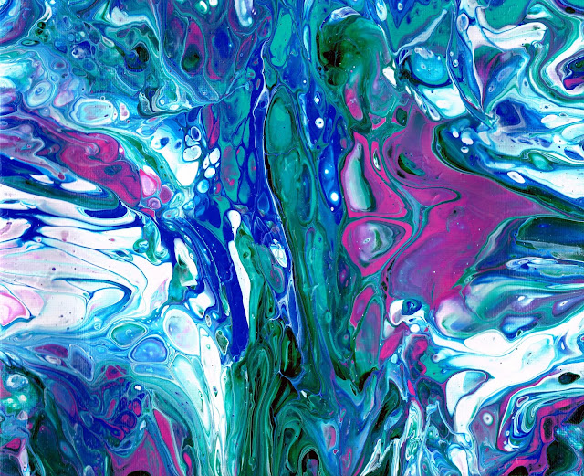
I was so surprised discovering all about Poured Acrylic paintings 3 weeks ago. I've since created over 40 of them and love each one for different reasons - here are some photographs! Thanks for stopping by - hoping you are enjoying your July!!


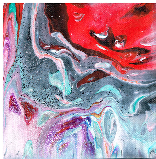


Inspired by the Cliffs of Moher, Ireland

Campfire Smoke

Dark Shadows

Embryo

Forest Fire

Gold Pool

Grand Canyon
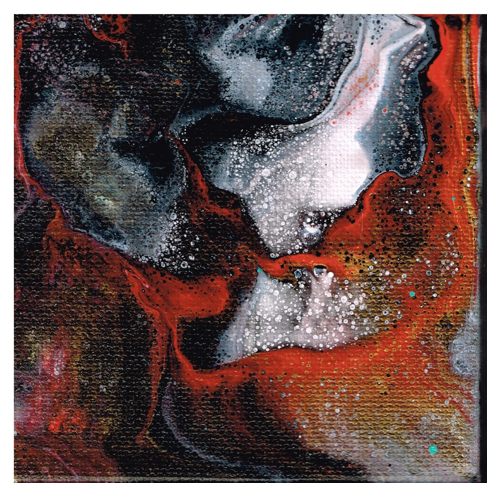
Inferno

Lavender Dreams

Malloy's Lake

Mt. Saint Helens

Nile River

This one was too big to scan in on my printer - so it's dark and murky - turn it sideways to the left and it's a surfer's Pacific Curl.

Purple Poppy

Reminds me of Saturn - don't know why - so it's name is: Saturn.

SPLASH!

The gold is not real apparent on this one - but it's there - and therefore
appropriately named: Sutter Hill.

Teal River

Teal Wonder

My Favorite - NOT FOR SELL

The Serpent

Unicorn Soup - why not? :-)

Violet Lace

Violet Lava

Violet Volcano

Just happened to have a cell turn into a heart at the end! WOW. I like that.

When I tried it again, I just got sea foam. :-)
Subscribe to:
Posts (Atom)